The bundle keeps the build brief and style notes together.
Inspired by Tether.to
Peg & Paws Reserve
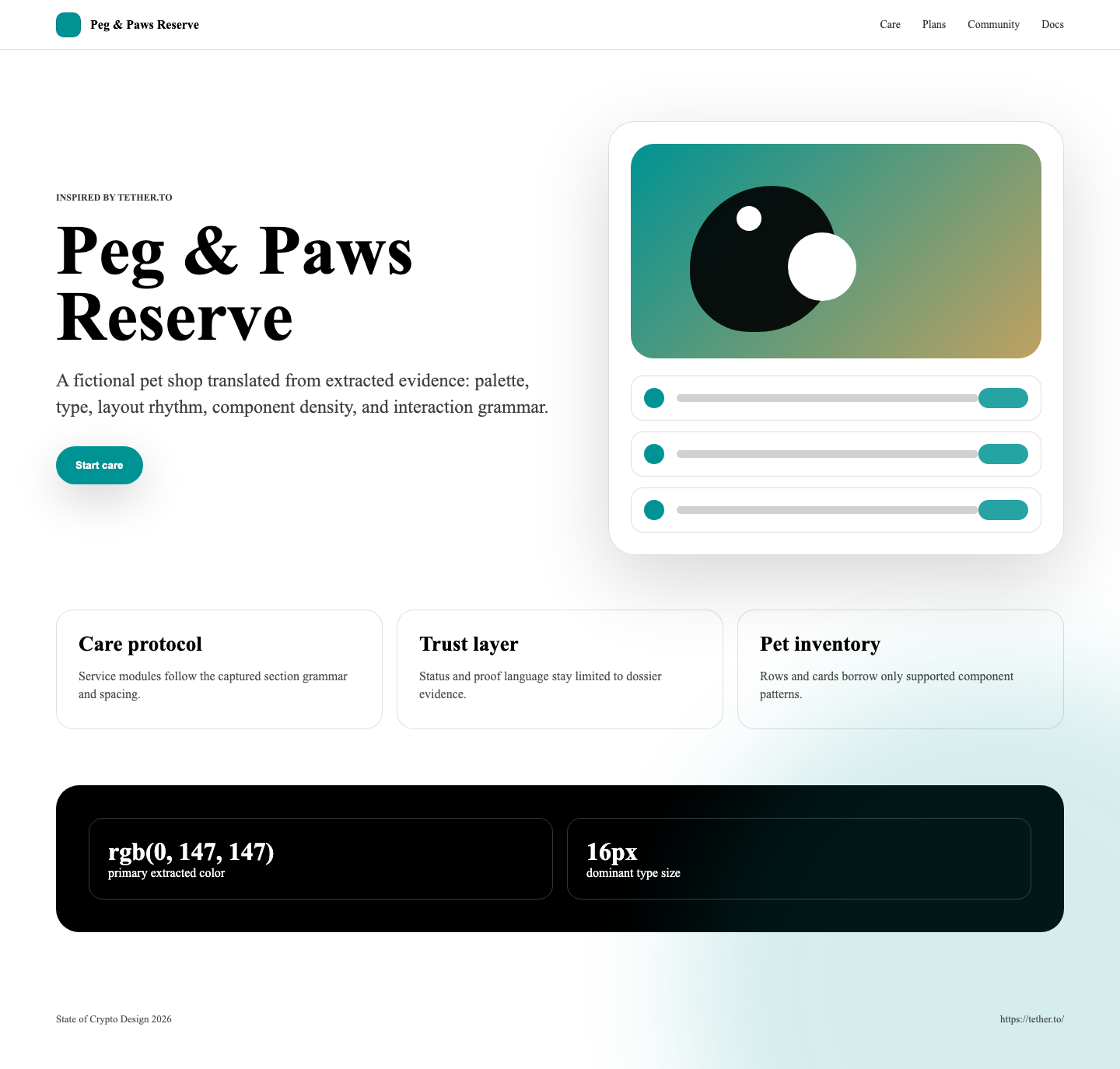
A pale institutional stablecoin trust surface translated into a fictional pet shop. Best for reserve-backed service explainers, token-like product pages, FAQ-led education, compliance-lite trust copy, and account-start landing pages built from white and near-white fields, teal actions, gold outlines, serif-forward body rhythm, abstract technical backgrounds, and careful footer navigation.
lightminimalinstitutionaltechnicallanding-pagedocs-site
Implementation bundle
Copy one clean packet, or just the pieces you need.
Copy the full bundle when you want an agent to build in this style. Use the individual files when you only need tokens, CSS, Tailwind, or component prompts.
Use CSS variables, Tailwind values, and JSON tokens when you need exact values.
Component prompts describe reusable patterns. Keep weak areas marked limited or unavailable.
# Peg & Paws Reserve Implementation Bundle

Use this as the build brief for an AI coding agent. The base remix prompt tells the agent what to make; the style kit adds evidence, component behavior, and known limits.

## Base Remix Prompt

Build an interface using the Tether.to-inspired Peg & Paws Reserve style kit.

Use a pale institutional pet-shop trust surface: `rgb(255, 255, 255)` and `rgb(249, 251, 251)` backgrounds, `rgb(0, 147, 147)` teal primary actions, `rgb(192, 161, 97)` gold outline actions, black or `rgb(35, 35, 35)` headings, muted `rgb(88, 104, 113)` copy, serif-forward content rhythm, Inter-style controls, abstract technical backgrounds, and 40px pill CTAs.

Concrete defaults from the capture: 16px dense text, 18-24px support copy, a 60px/73px hero h1 when space allows, teal contained buttons with `12.5px 39px` padding and `40px` radius, gold outlined buttons with `12.5px 25px` padding, FAQ accordions with expanded/collapsed states, and a dense footer resource system.

Use strongly for: institutional trust pages, hero sections, navigation, footer links, buttons, FAQ accordions, reserve/resource explainers, and abstract image direction.

Use with care for: flat proof cards, token/resource lists, simple trust labels, and cookie/preference dialogs.

Do not invent forms, analytic charts, dense tables, order books, trading dashboards, checkout flows, or live status systems from this kit. Do not use Tether logos, trademarks, raw source assets, readable source copy, or source screenshots.

Image generation prompt: original pale technical illustration for a fictional pet-care reserve service, teal geometry, subtle gold accent strokes, abstract token and ledger motifs, clean white and near-white surfaces, no logos, no readable text, no source screenshots, no signage, no watermark.


## Agent Kit

# Tether.to Pet Shop Agent Kit

This cleaned kit translates the captured Tether homepage into a fictional pet shop called Peg & Paws Reserve.

Use it for institutional trust surfaces: reserve-backed pet-care service pages, token-like membership explainers, FAQ-led onboarding, legal/resource hubs, and calm account-start landing pages. Evidence comes from `design-dossier/design-dossiers/tether-to/evidence.json`, `tokens.json`, `DESIGN.md`, `components.md`, and desktop/mobile screenshots captured from `https://tether.to/` with final metadata URL `https://tether.to/en/`.

## Visual Direction

- Page base: `rgb(255, 255, 255)` and `rgb(249, 251, 251)`.
- Primary teal: `rgb(0, 147, 147)` for filled CTAs, links, and key trust accents.
- Secondary gold: `rgb(192, 161, 97)` for outline CTAs and quiet secondary links.
- Text: black, `rgb(35, 35, 35)`, and muted `rgb(88, 104, 113)`.
- Typography: a serif-heavy captured rhythm with `"Times New Roman"` and Inter; default text clusters around `16px`, with a captured `60px/73px` hero h1.
- Shape: 40px pill CTAs, 6px utility radii, circular/50% decorative marks, and mostly 0px media radius.
- Imagery: pale abstract technical SVG-style backgrounds, soft teal geometry, reserve/token motifs, and no source logos or screenshots.

## Component Grammar

- Navigation: sparse top nav with education/trust links, login, teal signup, and dense footer link columns.
- Hero: full-width abstract background, left-start 500px copy block, short token-like headline, account CTA, and learn-more CTA.
- Buttons: teal filled pills and gold outlined pills, both with `40px` radius.
- FAQ: accordion rows with expanded/collapsed states.
- Cards: only use flat proof modules, FAQ rows, and partner/resource strips; no heavy card grid was evidenced.
- Lists: token/resource rows are allowed; dense tables and order books are not evidenced.
- Forms: unavailable in the capture.
- Charts: unavailable; chart-like detections were headings, SVGs, links, or logo-strip elements.
- Menus/modals: cookie dialog evidence exists; product menus are not strongly evidenced.

## Best Use Cases

- Institutional landing pages
- Reserve or guarantee explainers
- Pet-care membership/token pages
- FAQ-heavy support pages
- Trust and legal resource hubs
- Mobile web onboarding

## Evidence Limits

Strong: color system, typography, hero, navigation, buttons, abstract imagery, FAQ accordions, footer/resource links.

Limited: cards, token/resource lists, trust labels, modal behavior.

Unavailable: form systems, analytic charts, dense tables, order books, trading dashboards, checkout flows, and live product-status systems.