The bundle keeps the build brief and style notes together.
Inspired by Spark
Spark & Paws
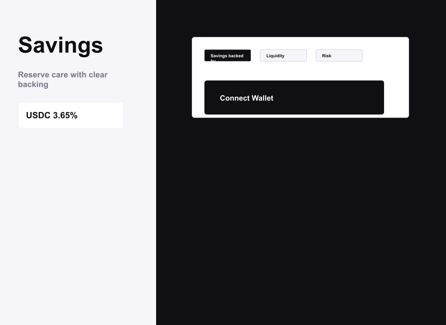
A savings workspace kit translated into Spark & Paws, with a split hero/app layout, bright white panels over dark/purple grounding, tabbed risk/liquidity content, and deposit CTA modules.
lightdashboardtechnicalminimalweb3-dashboardportfolio
Implementation bundle
Copy one clean packet, or just the pieces you need.
Copy the full bundle when you want an agent to build in this style. Use the individual files when you only need tokens, CSS, Tailwind, or component prompts.
Use CSS variables, Tailwind values, and JSON tokens when you need exact values.
Component prompts describe reusable patterns. Keep weak areas marked limited or unavailable.
# Spark & Paws Implementation Bundle

Use this as the build brief for an AI coding agent. The base remix prompt tells the agent what to make; the style kit adds evidence, component behavior, and known limits.

## Base Remix Prompt

Build an interface using the Spark-inspired Spark & Paws style kit.

A savings workspace kit translated into Spark & Paws, with a split hero/app layout, bright white panels over dark/purple grounding, tabbed risk/liquidity content, and deposit CTA modules.

Primary silhouette:
Use a savings-focused pet-care workspace: large left title, right atmospheric background/media, white analytic cards, black deposit panel, purple accent, and tabbed risk/liquidity proof. Avoid generic plan stat cards.

Composition:
Create a split canvas with nav/topbar, left savings content, right visual field, then stacked white sections for backing/liquidity/risk.

Above the fold:
Open with a Savings-style title, pet-care reserve rate selector, and visible deposit CTA panel; keep marketing copy restrained.

Core components:
- White information panels: Use white rectangular information panels for backing, liquidity, risk, and deposit details; keep radius small and typography precise.
- Deposit CTA panel: Use a deposit/action panel with amount, asset selector, wallet connect, and review state; keep fields compact and serious.
- Tabbed risk metrics: Use one tabbed metric area with simple bars or composition strips, not many independent charts.
- Rate and backing chips: Use small gray/purple chips for rate, liquidity, backed-by, risk rating, and sandbox states.

Image direction: Use abstract pet savings imagery: crisp white panels floating over a dark field, violet energy line, reserve bowl/bed silhouettes, no logos or readable text.

Do not use source logos, trademarks, proprietary assets, readable source text, or copied screenshots. Stay evidence-backed; if evidence is limited, keep the treatment directional and conservative.


## Agent Kit

# Spark Pet Shop Agent Kit

A savings workspace kit translated into Spark & Paws, with a split hero/app layout, bright white panels over dark/purple grounding, tabbed risk/liquidity content, and deposit CTA modules.

## Evidence-Backed Silhouette

### Savings workspace

Evidence: Evidence shows split-copy-and-media hero, background image on right, white and near-black panels, purple accent, Inter/Roobert type, Tab (3), savings nav items, and deposit CTA panels.

Prompt guidance: Use a savings-focused pet-care workspace: large left title, right atmospheric background/media, white analytic cards, black deposit panel, purple accent, and tabbed risk/liquidity proof. Avoid generic plan stat cards.

### Split app canvas

Evidence: Evidence records a grid min-h-screen layout, right background image width 1010px, main padding bottom 64px, and 32px panel padding.

Prompt guidance: Create a split canvas with nav/topbar, left savings content, right visual field, then stacked white sections for backing/liquidity/risk.

### Savings first screen

Evidence: Hero evidence is split-copy-and-media with Savings heading and USDC rate navigation items.

Prompt guidance: Open with a Savings-style title, pet-care reserve rate selector, and visible deposit CTA panel; keep marketing copy restrained.

### White information panels

Evidence: Evidence includes rounded-sm white sections with tabs and deposit panel modules.

Prompt guidance: Use white rectangular information panels for backing, liquidity, risk, and deposit details; keep radius small and typography precise.

### Deposit CTA panel

Evidence: Evidence includes deposit CTA panel, buttons, wallet connect, and sandbox actions.

Prompt guidance: Use a deposit/action panel with amount, asset selector, wallet connect, and review state; keep fields compact and serious.

### Tabbed risk metrics

Evidence: Chart/metric evidence exists, with tabs for savings-backed-by/liquidity/risk and time ranges.

Prompt guidance: Use one tabbed metric area with simple bars or composition strips, not many independent charts.

### Rate and backing chips

Evidence: Savings navigation items and risk/liquidity tabs support compact labels.

Prompt guidance: Use small gray/purple chips for rate, liquidity, backed-by, risk rating, and sandbox states.

### White panel over dark field

Evidence: Palette evidence is white/f5f5fa, near-black, purple, gray.

Prompt guidance: Use abstract pet savings imagery: crisp white panels floating over a dark field, violet energy line, reserve bowl/bed silhouettes, no logos or readable text.

## Image Direction

Use abstract pet savings imagery: crisp white panels floating over a dark field, violet energy line, reserve bowl/bed silhouettes, no logos or readable text.

Do not use source logos, trademarks, proprietary assets, or raw source screenshots. Concrete visual decisions must remain tied to the cleaned kit evidence and copied artifacts.