The bundle keeps the build brief and style notes together.
Inspired by Solana.com
Pawana
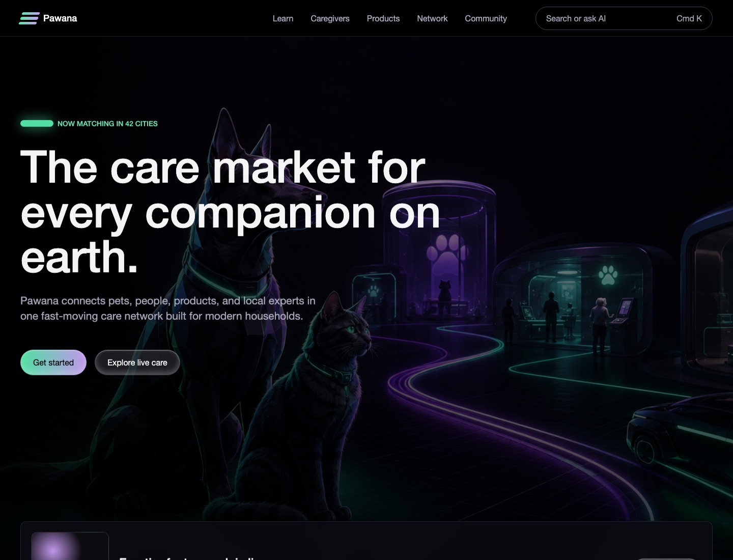
A dark neon network and ecosystem kit translated into a fictional pet shop. Best for cinematic pet-care launch pages, community ecosystems, technical service networks, event/content feeds, category panels, and stat-led dashboards that do not require dense exchange tables or full transactional forms.
darkeditorialdashboardtechnicalweb3-dashboardlanding-page
Implementation bundle
Copy one clean packet, or just the pieces you need.
Copy the full bundle when you want an agent to build in this style. Use the individual files when you only need tokens, CSS, Tailwind, or component prompts.
Use CSS variables, Tailwind values, and JSON tokens when you need exact values.
Component prompts describe reusable patterns. Keep weak areas marked limited or unavailable.
# Pawana Implementation Bundle

Use this as the build brief for an AI coding agent. The base remix prompt tells the agent what to make; the style kit adds evidence, component behavior, and known limits.

## Base Remix Prompt

Build an interface using the evidence-backed Solana.com-inspired Pawana pet shop kit.

Use a dark high-performance network system translated to pet care: black and near-black surfaces, a sticky translucent nav, full-bleed cinematic hero imagery, huge left-aligned white typography, muted gray support copy, mint/violet neon accents, pill CTAs, image-led event/story cards, lavender-tinted ecosystem cards, category/filter panels, compact badges, and community/service-network sections.

Concrete values to preserve where practical: canvas `#000000`, surface `#0d0c11`, nav `rgba(18, 18, 18, 0.95)`, panel `rgba(236, 228, 253, 0.12)`, strong border `rgba(236, 228, 253, 0.2)`, primary text `#ffffff`, muted text `#ababbc`, soft text `rgba(255, 255, 255, 0.64)`, mint `#55e9ab`, green `#6ee7b7`, violet `#ca9ff5`, pill radius `9999px`, card radius `12px`, primary CTA padding `12px 20px`, carousel controls `48px`, and hero type up to `88px/88px` on desktop.

Strong areas: overall style, color system, typography, layout, navigation, hero, buttons, cards, badges/status, category tabs/filters, menus/modals, image style, and interaction states.

Limited areas: forms should only borrow the rounded dark search/input pill treatment; charts should be compact stat blocks and indicators, not full analytic suites.

Unavailable areas: do not invent dense tables, order books, exchange grids, or full transactional checkout/onboarding forms from this kit.

Image prompt: original fictional Pawana pet-care network scene, black and near-black background, glossy depth, mint/cyan/violet/purple light trails, connected adoption/grooming/vet/training nodes, premium technology infrastructure mood, cinematic full-bleed crop, no logos, no readable text, no letters, no signage, no source screenshots, no watermark.


## Agent Kit

# Solana.com Pet Shop Agent Kit

Status: evidence-backed fictional pet shop kit.

Fictional brand: Pawana.
Source capture: https://solana.com/ at 2026-05-02T03:46:28.319Z.
Evidence source: /Users/qz/Documents/Builds/design-dossier/design-dossiers/solana-com/evidence.json, tokens.json, DESIGN.md, and components.md.

Use this kit for cinematic pet-care launch pages, technical service-network marketing, community/event ecosystems, category panels, and stat-led dashboards. The strongest source grammar is a black full-bleed hero with oversized left-aligned type, sticky translucent navigation, pill controls, horizontal content/event bands, lavender-tinted ecosystem cards, and mint/violet neon accents.

## Evidence-Backed Tokens

- Canvas and surfaces: `#000000`, `#0d0c11`, `rgba(18, 18, 18, 0.95)`, `rgba(0, 0, 0, 0.7)`, and `rgba(236, 228, 253, 0.12)`.
- Borders and glass: `rgba(236, 228, 253, 0.12)`, `rgba(236, 228, 253, 0.2)`, `rgba(255, 255, 255, 0.1)`, and `#374151`.
- Text: white, `#ababbc`, `#848895`, `#9ca3af`, and `rgba(255, 255, 255, 0.64)`.
- Accents: mint `#55e9ab`, green `#6ee7b7`, violet `#ca9ff5`; use `#cff15e`, `#f48252`, and `#ffc526` only as sparse supporting accents.
- Radii: `9999px` pills, `12px` cards, `16px` panels, `8px` small surfaces, and `4px` chips.
- Spacing: common values are `4px`, `8px`, `12px`, `16px`, `20px`, `24px`, `32px`, `40px`, `48px`, and large `120px` section rhythm.
- Type: Diatype-style sans; `88px/88px` hero, `64px/72px` display, `40px/48px` sections, `21px/29.4px` cards, `16px/24px` body/nav, `14px/20px` small labels, and sparse `DSemi, monospace` category labels.

## Component Grammar

- Navigation: sticky dark `#navbar`, 12px vertical padding, grouped triggers for Learn/Developers/Products/Network/Community, search/AI pill, language utility, and mobile dialog menu.
- Hero: 1440x1040 full-bleed cover media, 0px media radius, black section, left-aligned oversized headline, muted support copy, and pill CTAs.
- Buttons: white primary pills with black text and `12px 20px` padding; transparent/glass secondary pills; 48px circular carousel controls with disabled states.
- Cards: image-led event/story cards plus ecosystem cards on `rgba(236, 228, 253, 0.12)`, `12px` radius, 20-32px padding, white titles, muted copy.
- Category panels: terminal-like filters adapted from All/DeFi/Institutions/Consumer/Developers/Ecosystem; use mono labels and neon active indicators sparingly.
- Badges/status: compact tinted chips for live coverage, secure care, verified network nodes, service category, and community status.
- Footer/social: muted link stacks, rounded social pills, black or near-black background.

## Limits

The source evidence does not support dense tables, order books, exchange grids, or full transactional form systems. Forms are limited to the rounded dark search/input treatment. Charts are limited to stat blocks, indicator icons, and simple metric cues.

## Image Direction

The public Pawana proof images are fictional desktop/mobile pet-shop previews, not source screenshots. For new imagery, generate original dark editorial pet-care network scenes with black negative space, glossy depth, mint/cyan/violet/purple light trails, connected adoption/grooming/vet/training nodes, no logos, no letters, no readable text, no signage, and no source brand marks.