The bundle keeps the build brief and style notes together.
Inspired by OKX.com
Lion City Leash
A stark Singapore-market exchange kit translated into a fictional pet shop. Best for secure account starts, app-led pet services, portfolio-style inventory lists, deposit/trade-style care actions, FAQ-heavy reassurance, and dense global navigation in a black, white, and neutral-gray system.
darklightminimaldashboardexchangewallet
Implementation bundle
Copy one clean packet, or just the pieces you need.
Copy the full bundle when you want an agent to build in this style. Use the individual files when you only need tokens, CSS, Tailwind, or component prompts.
Use CSS variables, Tailwind values, and JSON tokens when you need exact values.
Component prompts describe reusable patterns. Keep weak areas marked limited or unavailable.
# Lion City Leash Implementation Bundle

Use this as the build brief for an AI coding agent. The base remix prompt tells the agent what to make; the style kit adds evidence, component behavior, and known limits.

## Base Remix Prompt

Build an interface using the evidence-backed OKX.com-inspired Lion City Leash pet shop kit.

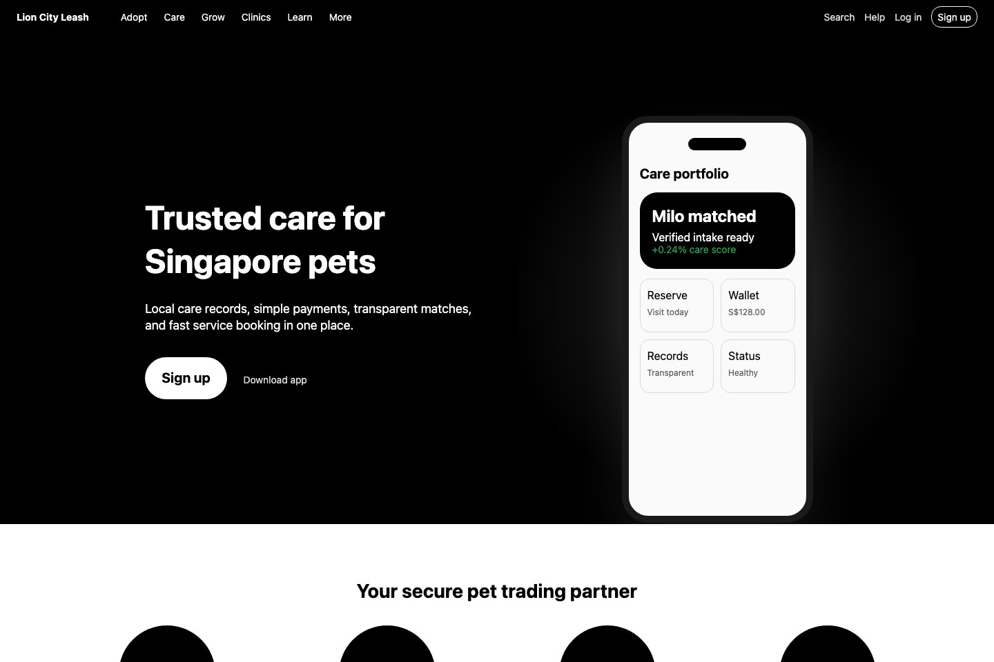
Use a stark local-market exchange style translated to pet care: black split hero, white 100px-radius pill actions, compact dark global navigation, tall app mockups, trust proof cards, app-step service panels, 25px rounded pet inventory rows, green/red status movement, search dialog, mobile menu state, FAQ expanders, and dense footer columns.

Concrete values to preserve where practical: `rgb(0, 0, 0)`, `rgb(255, 255, 255)`, `rgb(36, 36, 36)`, `rgb(250, 250, 250)`, `rgb(144, 144, 144)`, `rgb(37, 167, 80)`, `rgb(202, 63, 100)`, 48px/63.36px bold desktop hero type, 14px dense navigation and row labels, 100px CTA pills, 25px inventory rows, 8px utility buttons, 80px and 120px section padding, and a 48px header.

Strong areas: overall style, color system, typography, layout, navigation, hero, buttons, cards, rounded asset-list rows, trust/status badges, search, grouped menus, mobile menu state, FAQ interactions, and app-led imagery.

Limited areas: use search/account-start inputs only; use portfolio rows instead of full tables/order books; do not invent chart suites because charts were not detected.

Image generation prompt: original fictional Singapore pet-care app marketplace, black and white split hero, tall phone mockups, rounded inventory rows, simple proof icons, green and red care status values, compact product navigation, no logos, no source screenshots, no OKX marks, no trademarks, no readable source text, no watermark.


## Agent Kit

# OKX.com Pet Shop Agent Kit

Status: evidence-backed fictional pet shop kit.

Fictional brand: Lion City Leash.
Source capture: https://www.okx.com/ at 2026-05-02T17:00:38.083Z.
Evidence source: /Users/qz/Documents/Builds/design-dossier/design-dossiers/okx-com/evidence.json, tokens.json, DESIGN.md, components.md, interactions.md, and product-patterns.md.

Use this kit for secure local-market pet-shop onboarding, app-led service flows, portfolio-style pet inventory rows, deposit/trade-style care actions, trust proof sections, search/menu interactions, and dense global navigation. The strongest grammar is a black split hero with a white pill CTA and tall app mockup, followed by trust cards, app-step media, rounded inventory rows, product action tiles, FAQ rows, and a wide footer.

## Evidence-Backed Tokens

- Dominant contrast: `rgb(0, 0, 0)` and `rgb(255, 255, 255)`.
- Dark controls/surfaces: `rgb(36, 36, 36)`, `rgb(26, 26, 26)`, `rgb(33, 33, 33)`.
- Light support surfaces: `rgb(250, 250, 250)` and `rgb(247, 247, 247)`.
- Muted labels: `rgb(144, 144, 144)`, `rgb(91, 91, 91)`, `rgb(179, 179, 179)`, and `rgb(217, 217, 217)`.
- Status: `rgb(37, 167, 80)` positive and `rgb(202, 63, 100)` risk/negative.
- Type: OKXSans-style system stack; 48px/63.36px bold desktop hero; dense 14px nav, footer, and asset rows; 16-20px action labels; 24-28px section headings.
- Shapes: 100px CTA pills, 25px asset rows, 60px progress dots, 14px header signup, 8px utility buttons, 2px language selector.
- Spacing: 8px, 12px, 16px, 20px, 24px, 32px, 40px, 80px, and 120px are the strongest repeated values.

## Component Grammar

- Navigation: 48px header, compact dark product groups, search, app download, notification/help/language utilities, login/signup, and dense footer columns.
- Hero: split-copy-and-media with left-aligned local trust copy, white pill CTA, secondary app path, and a tall phone/app proof area.
- Proof cards: regulatory/security-style pet-care claims with large simple 140px media slots.
- App steps: horizontal or stacked phone-like service previews for signup, deposit, purchase, and transparent records.
- Inventory rows: rounded 25px list rows with pet code/name, price or care metric, green/red movement, and quick action.
- Product action tiles: deposit, automation, buy, and trade flows translated to pet shop services.
- FAQ: dark high-contrast question rows with expanded/collapsed states.
- Inputs: search dialog and one account-start field only; keep form surfaces compact and minimal.

## Limits

The capture did not expose direct chart grammar, full data grids, order books, loading/empty states, or deep checkout/KYC forms. Use rounded inventory rows, trust/status labels, and search/menu dialogs; bring another kit for chart suites or dense administrative tables.

## Image Direction

Create original proof imagery: fictional pet-care app screens, tall phone mockups, stark black/white layouts, grayscale service modules, simple 140px proof icons, green/red status details, and local-market trust cues. Do not use source screenshots, OKX logos, source marks, trademarks, readable source text, or proprietary source assets.