The bundle keeps the build brief and style notes together.
Inspired by Kraken.com
Tidepool Trading Co.
An evidence-backed exchange and onboarding kit translated into a fictional pet shop. Best for secure account starts, asset-style inventory rails, reward/status lists, portfolio-like care dashboards, and broad product navigation with serious consumer trust.
lightdarkdashboardinstitutionalexchangeweb3-dashboard
Implementation bundle
Copy one clean packet, or just the pieces you need.
Copy the full bundle when you want an agent to build in this style. Use the individual files when you only need tokens, CSS, Tailwind, or component prompts.
Use CSS variables, Tailwind values, and JSON tokens when you need exact values.
Component prompts describe reusable patterns. Keep weak areas marked limited or unavailable.
# Tidepool Trading Co. Implementation Bundle

Use this as the build brief for an AI coding agent. The base remix prompt tells the agent what to make; the style kit adds evidence, component behavior, and known limits.

## Base Remix Prompt

Build an interface using the evidence-backed Kraken.com-inspired Tidepool Trading Co. pet shop kit.

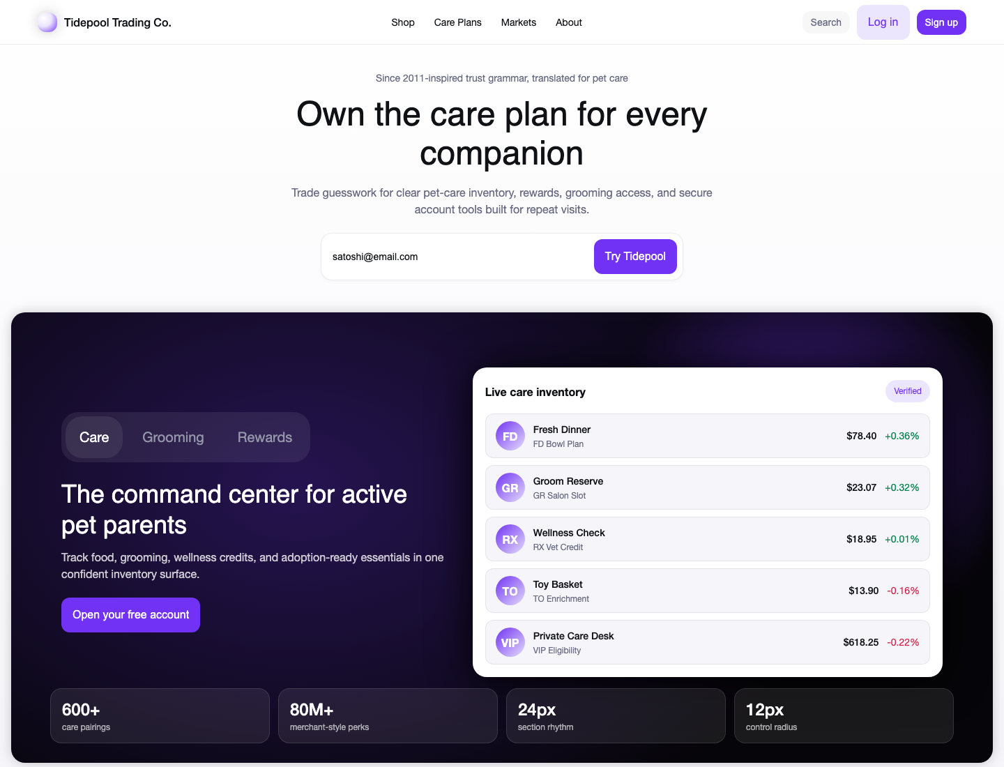
Use a trustworthy exchange/onboarding style translated to pet care: white account-start canvas, centered hero copy, email signup, broad grouped navigation, violet 12px-radius primary actions, dark 20px-radius product dashboard panels, compact asset-list-style pet inventory rows, tabs, search, reward/status badges, and dense footer links.

Concrete values to preserve where practical: `rgb(113, 50, 245)` primary actions, `rgba(133, 91, 251, 0.16)` soft violet fills, `rgb(16, 17, 20)` primary text, `rgb(104, 107, 130)` muted text, 12px controls/cards, 20px media panels, 48px/56px desktop h1, 32px/40px mobile h1, and 14px dense navigation or row labels.

Strong areas: overall style, color system, typography, layout, navigation, hero, buttons, cards, forms, tabs, badges/status, asset-list rows, grouped menus, and interaction states.

Limited areas: use market-list-inspired inventory rows instead of full tables/order books; use sparklines and metric indicators instead of full chart suites; keep modal behavior minimal.

Image prompt: original fictional pet-care exchange dashboard, white onboarding area, dark rounded violet-black product panel, tidy pet inventory rows, reward badges, clean device/card depth, no logos, no Kraken marks, no source screenshots, no trademarks, no watermark.


## Agent Kit

# Kraken.com Pet Shop Agent Kit

Status: evidence-backed fictional pet shop kit.

Fictional brand: Tidepool Trading Co.
Source capture: https://www.kraken.com/ at 2026-05-02T16:34:32.902Z.
Evidence source: /Users/qz/Documents/Builds/design-dossier/design-dossiers/kraken-com/evidence.json, tokens.json, DESIGN.md, and components.md.

Use this kit for secure pet-shop account starts, asset-style inventory dashboards, reward/status rails, pet-care portfolio summaries, and broad product navigation. The strongest source grammar is a centered conversion hero above a very wide 20px-radius dark media panel, followed by stacked product bands and dense footer navigation.

## Evidence-Backed Tokens

- Primary action: `rgb(113, 50, 245)`.
- Soft violet action fill: `rgba(133, 91, 251, 0.16)`.
- Text: `rgb(16, 17, 20)`, `rgb(104, 107, 130)`, `rgb(148, 151, 169)`, and white on dark panels.
- Surfaces: `rgb(255, 255, 255)`, `rgb(246, 245, 249)`, `rgb(16, 17, 20)`, `rgb(11, 4, 26)`, and `rgb(22, 18, 31)`.
- Radii: 12px controls/cards, 20px media panels, 16px/24px tabs, 9999px pills.
- Type: Kraken Product/Brand-style sans stacks; 48px/56px desktop h1, 32px/40px mobile h1, 36px/44px desktop h2, 24px/32px mobile h2, 16px/24px body, 14px nav/rows.

## Component Grammar

- Navigation: broad product groups, search, login, sign-up, and dense footer links.
- Hero: centered account-start copy with email signup and violet CTA.
- Product bands: dark rounded cards with centered white headings and dashboard-like pet-care previews.
- Asset rows: pet inventory rows with symbol/avatar, short code, price or adoption metric, movement/status, and action.
- Tabs: compact filters based on Spot / Margin, Futures, xStocks evidence; translate to Care, Grooming, Rewards, or similar pet-shop labels.
- Forms: email and search only; keep validation simple and visible.
- Badges: verified, reward, secure, positive movement, risk/eligibility.

## Limits

The capture did not expose full tables/grids, complete chart suites, or modal workflows. Use asset-list rows, metric indicators, and grouped menus, then bring another kit for advanced table, order-book, or modal behavior.

## Image Direction

Create original proof imagery: fictional pet-care dashboards, clean card depth, dark radial violet/black media panels, tidy inventory rows, no logos, no source screenshots, no source brand marks, no readable source text copied from Kraken.