The bundle keeps the build brief and style notes together.
Inspired by Ethereum.org
Commons & Co.
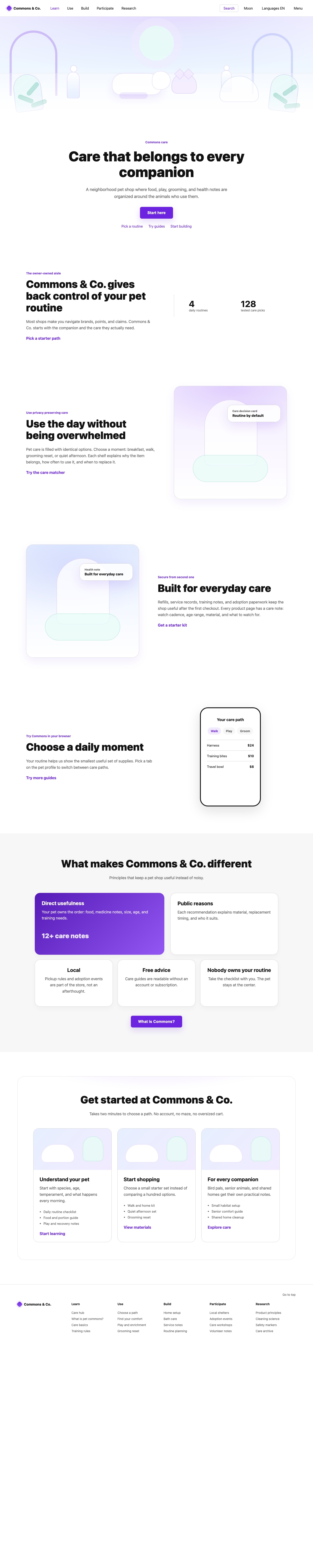
A light civic education system translated into a fictional pet shop. Best for public-good landing pages, docs-like learning hubs, wallet-style onboarding, community education, and low-pressure guided product flows built from wide editorial media, centered copy, Inter typography, purple actions, rounded learning cards, and calm pastel illustration.
lighteditorialconsumerillustratedlanding-pagedocs-site
Implementation bundle
Copy one clean packet, or just the pieces you need.
Copy the full bundle when you want an agent to build in this style. Use the individual files when you only need tokens, CSS, Tailwind, or component prompts.
Use CSS variables, Tailwind values, and JSON tokens when you need exact values.
Component prompts describe reusable patterns. Keep weak areas marked limited or unavailable.
# Commons & Co. Implementation Bundle

Use this as the build brief for an AI coding agent. The base remix prompt tells the agent what to make; the style kit adds evidence, component behavior, and known limits.

## Base Remix Prompt

Build an interface using the Ethereum.org-inspired Commons & Co. style kit.

Use a light civic education system: `rgb(255, 255, 255)` canvas, `rgb(247, 247, 247)` support bands, `rgb(18, 18, 18)` ink, `rgb(97, 97, 97)` muted copy, purple `rgb(108, 36, 224)` links and primary actions, Inter-style type, wide editorial illustration, rounded learning cards, and calm public-good language.

Structure the page like the evidence: sticky knowledge-site navigation; wide media-above-centered-copy hero; centered headline and purple CTA; alternating split text/media education bands; one soft gray differentiation section with rounded cards and a purple gradient highlight; get-started cards; and a compact multi-column footer.

Use the kit strongly for: overall style, color system, typography, layout, navigation, hero, buttons, cards, menus/modals, image style, and interaction states.

Use the kit carefully for: educational list rows, wallet/resource paths, small metrics, and soft completion labels. Do not use it as the primary source for visible form systems, dense tables, trading charts, checkout, or financial dashboards.

Image generation prompt: pastel civic ecosystem illustration for a fictional pet-care commons, thin violet/indigo linework, soft lavender/blue/mint/green fills, clean white light, friendly educational composition, no source logos, no readable text, no signage, no watermark, no source screenshots.


## Agent Kit

# Ethereum.org Pet Shop Agent Kit

This cleaned kit translates the captured ethereum.org homepage into a fictional pet shop called Commons & Co.

Use it for light civic education interfaces: public-good landing pages, docs-like learning hubs, wallet-style onboarding, community guides, and calm product explainers. The strongest evidence comes from `design-dossier/design-dossiers/ethereum-org/evidence.json`, `tokens.json`, `DESIGN.md`, `components.md`, `interactions.md`, and `product-patterns.md`, captured from `https://ethereum.org/` on 2026-05-01.

## Visual Direction

- White canvas with soft gray teaching sections: `rgb(255, 255, 255)` and `rgb(247, 247, 247)`.
- High-contrast ink and muted copy: `rgb(18, 18, 18)` and `rgb(97, 97, 97)`.
- Ethereum-purple actions and links: `rgb(108, 36, 224)` with hover/gradient support from `rgb(147, 87, 244)` and darker purple `rgb(65, 18, 140)`.
- Support colors from the capture include green `rgb(15, 153, 114)`, green `rgb(22, 162, 73)`, blue `rgb(61, 76, 235)`, and pale surfaces `rgb(230, 239, 255)`, `rgb(232, 252, 247)`, and `rgb(242, 235, 255)`.
- Use Inter-style product/editorial typography. `tokens.json` records Inter at 1366 occurrences, with 16px and 14px as the workhorse sizes and 48px, 60px, and 64px for major headings.
- The proof should feel civic and educational: friendly, open-source, calm, global, and low-pressure.

## Component Grammar

- Navigation: sticky white knowledge-site header, grouped triggers for Learn, Use, Build, Participate, and Research, search, language, theme controls, and a simple mobile dialog.
- Hero: `wide-media-above-centered-copy`; use a wide 0px-radius illustrated banner above centered ownership-oriented copy and one purple primary CTA.
- Buttons: purple filled CTA with 18px text, `12px 32px` padding, and 8px radius; transparent text buttons with `8px 16px` padding and 4px radius; outlined footer utilities for secondary actions.
- Cards: rounded 24-32px educational cards, get-started cards, soft gray section blocks, and one purple gradient highlight panel.
- Lists: simple guide, wallet, asset, or resource rows are fine. Do not build dense data tables from this kit.
- Menus and modals: Radix-style grouped menus and mobile dialog are evidenced; keep surfaces white, readable, and lightly bordered.
- Interaction states: expanded/collapsed menus, disabled carousel controls, guide next/back actions, visible focus outlines, and soft purple hover states.
- Footer: multi-column educational footer with Learn, Use, Build, Participate, and Research link groups at compact 14px scale.

## Image Direction

Create pastel civic ecosystem illustrations with thin violet or indigo linework, soft lavender/blue/mint/green fills, clean white light, and community pet-care scenes. The public proof screenshots at `/kits/ethereum-org/desktop.jpg` and `/kits/ethereum-org/mobile.jpg` are generated fictional compositions and must not use source screenshots, source logos, readable Ethereum text, watermarks, or proprietary source assets.

## Best Use Cases

- Public-good or education-first landing pages
- Documentation and learning hubs
- Wallet or ownership onboarding
- Developer-tool explainers
- Community guide pages
- Mobile web onboarding flows

## Evidence Limits

- Strong: overall style, color system, typography, layout, navigation, hero, buttons, cards, menus/modals, image style, and interaction states.
- Limited: list-like asset/resource rows, metric/icon cues, and soft status labels.
- Unavailable: visible input/select form systems, dense data tables, order books, analytic dashboards, checkout flows, and heavy financial status systems.