The bundle keeps the build brief and style notes together.
Inspired by Coinbase.com
Blue Leash
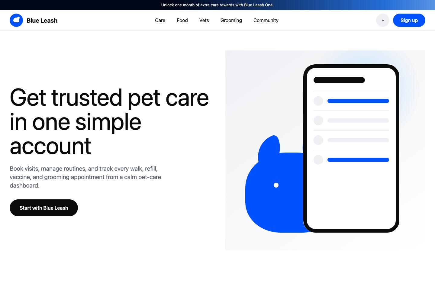
A bright trust-first product system translated into a fictional pet shop. Best for account onboarding, mobile product pages, secure service lists, subscription benefit bands, and simple dashboard previews built from white space, black type, blue actions, pill controls, and asset-list rows.
lightminimaldashboardinstitutionalexchangewallet
Implementation bundle
Copy one clean packet, or just the pieces you need.
Copy the full bundle when you want an agent to build in this style. Use the individual files when you only need tokens, CSS, Tailwind, or component prompts.
Use CSS variables, Tailwind values, and JSON tokens when you need exact values.
Component prompts describe reusable patterns. Keep weak areas marked limited or unavailable.
# Blue Leash Implementation Bundle

Use this as the build brief for an AI coding agent. The base remix prompt tells the agent what to make; the style kit adds evidence, component behavior, and known limits.

## Base Remix Prompt

Build an interface using the Coinbase.com-inspired Blue Leash style kit.

Use a bright trust-first product system: `rgb(255, 255, 255)` canvas, `rgb(238, 240, 243)` and `rgb(247, 248, 249)` support bands, `rgb(10, 11, 13)` ink, `rgb(91, 97, 110)` muted text, `rgb(0, 82, 255)` primary blue actions, pill controls, split hero, square app mockup media, trust proof blocks, dark promotional carousel bands, tabbed asset/service lists, and broad footer navigation.

Concrete defaults from the capture: CoinbaseDisplay-style hero up to `80px/80px`, CoinbaseSans-style UI text at `16px`, section headings around `52px`, black/blue/white buttons with `56px` radius, nav triggers and carousel dots up to `100000px` radius, status green `rgb(39, 173, 117)`, and status red `rgb(240, 97, 109)`.

Use the kit strongly for: overall style, color system, typography, layout, navigation, hero, buttons, tabs, asset-list rows, mobile menu behavior, image style, and interaction states.

Use with care for: cards, charts, status badges, and table-like layouts. The evidence supports flat proof blocks, clean summary chart previews, and row-based asset/service lists, but not dense tables or full advanced-trading views.

Do not invent complete form systems, order books, KYC flows, checkout flows, or dense admin tables from this kit. Do not use Coinbase logos, trademarks, raw source assets, readable source copy, or source screenshots.

Image generation prompt: clean light product illustration for a fictional pet-care app, square app mockup, saturated blue accents, white and pale gray surfaces, simple pictogram-like pet-care shapes, calm secure product tone, no logos, no readable text, no letters, no source screenshots, no signage, no watermark.


## Agent Kit

# Coinbase.com Pet Shop Agent Kit

This cleaned kit translates the captured Coinbase Singapore homepage into a fictional pet shop called Blue Leash.

Use it for bright, trust-first product interfaces: account onboarding, mobile app product pages, secure service lists, subscription benefit bands, simple dashboard previews, and consumer-facing finance-style flows. The strongest evidence comes from `design-dossier/design-dossiers/coinbase-com/evidence.json`, `tokens.json`, `DESIGN.md`, and `components.md`, captured from `https://www.coinbase.com/` with final URL `https://www.coinbase.com/en-sg`.

## Visual Direction

- White canvas with light-gray support sections: `rgb(255, 255, 255)`, `rgb(238, 240, 243)`, and `rgb(247, 248, 249)`.
- Black product ink: `rgb(10, 11, 13)` with muted copy at `rgb(91, 97, 110)`.
- Saturated blue actions: `rgb(0, 82, 255)`, plus link blues `rgb(6, 103, 208)` and `rgb(87, 139, 250)`.
- Status colors from the capture: green `rgb(39, 173, 117)` and red `rgb(240, 97, 109)`.
- Split hero: large left-aligned display heading, concise support copy, pill CTA, and square 0px-radius app/product media.
- Product sections alternate between white, pale gray, and one dark promotional band using `rgb(20, 21, 25)` and `rgb(40, 43, 49)`.

## Component Grammar

- Navigation: promo strip, grouped text navigation, rounded nav triggers, search/language controls, plain sign-in, blue signup pill, and mobile menu dialog.
- Hero: `split-copy-and-media`; captured hero text box is 664px wide and hero media is 664px square on desktop.
- Buttons: black, blue, and white pills with `56px` radius; nav triggers and carousel dots may use `100000px`.
- Asset/service lists: row-based lists with icon, name, price/status, trend/status color, and action. Treat these as list rows, not full tables.
- Tabs: pill tabs on dark rails with selected/unselected states.
- Carousel: dark promotional panel with 56px circular controls and disabled states.
- Trust proof: flat proof blocks with pictogram-like icons and concise headings.
- Menus/modals: mobile menu behavior is captured; keep menus simple and grouped.

## Image Direction

Create clean product imagery with square app mockups, light editorial illustration, blue geometric accents, and simple pictogram-like pet-care shapes. The dossier image prompts require no logos, no letters, no readable text, no signage, no watermark, no source screenshots, and no proprietary source assets.

## Best Use Cases

- Account-opening landing pages
- Wallet or portfolio onboarding
- Mobile product pages
- Secure service marketplaces
- Consumer dashboard previews
- Asset-list or plan-list pages

## Evidence Limits

- Strong: overall style, colors, typography scale, layout, navigation, hero, buttons, tabs, asset-list rows, mobile menu behavior, image style, and basic interaction states.
- Limited: cards as independent components, chart previews, status labels, and table-like layouts beyond asset/service rows.
- Unavailable: visible input/select form systems, dense data tables, order books, full KYC/checkout flows, and advanced trading interactions.